This guide is your starting point for bringing the Freepik brand to life. By following the principles outlined in this brandbook, you’ll help establish our unique identity and communicate effectively. Let’s create an amazing story together.
Know more01 Who we are
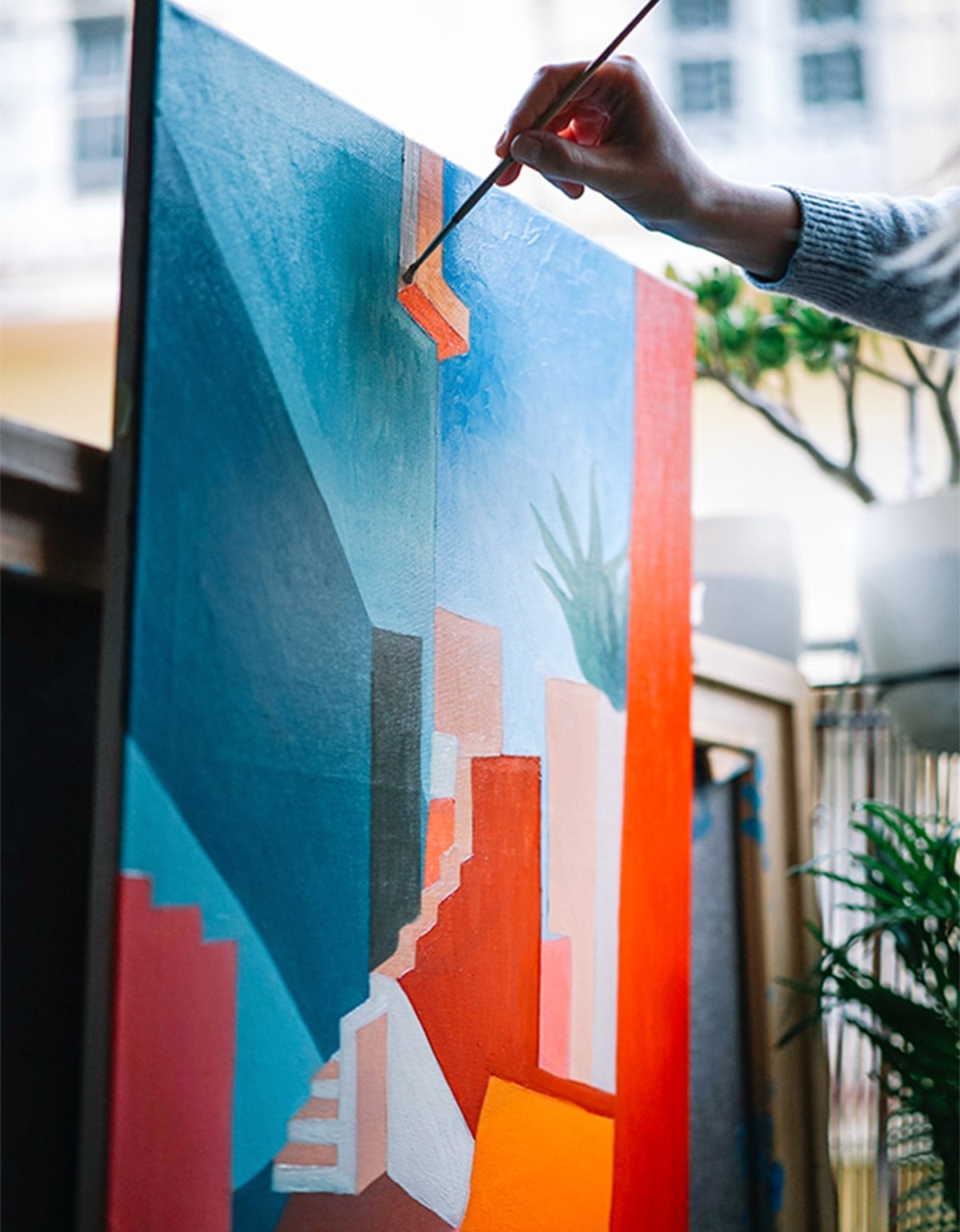
Joyful
rebelliousness
The way we face life is by expressing joy through images, words, creativity. We don’t follow all the standards, because we prefer to create them.


Hi! Here is Freepik.
We’re a surprising plot twist who defies expectations.
We find talent and inspiration everywhere and love to share it with the world. Our mind is restless: We see the world through kaleidoscopic eyes, finding the extraordinary in the unanticipated. We like to think outside the box, where unpredictable possibilities bloom like confetti.
We believe in the power of good design and love to share it with everyone we meet.
At the end of the day, what we enjoy the most is helping others turn their ideas into great designs faster, easier and better.
Know more
02 Why we exist
Freepik helps anyone create great design faster to express the power of their ideas
- Our platform is for everyone regardless of age, religion or economic class.
- Great design should be visually pleasing and ultimately, solves a problem.
- It must be understood by the intended audience to be properly expressed.
- The messenger is empowered when the idea lands with impact.
- Good ideas can change the world.
03 Our assets
Logo and applications
In this section you will find our brand assets ready to download. Learn how to use them to bring the Freepik brand to life.
Download brand book
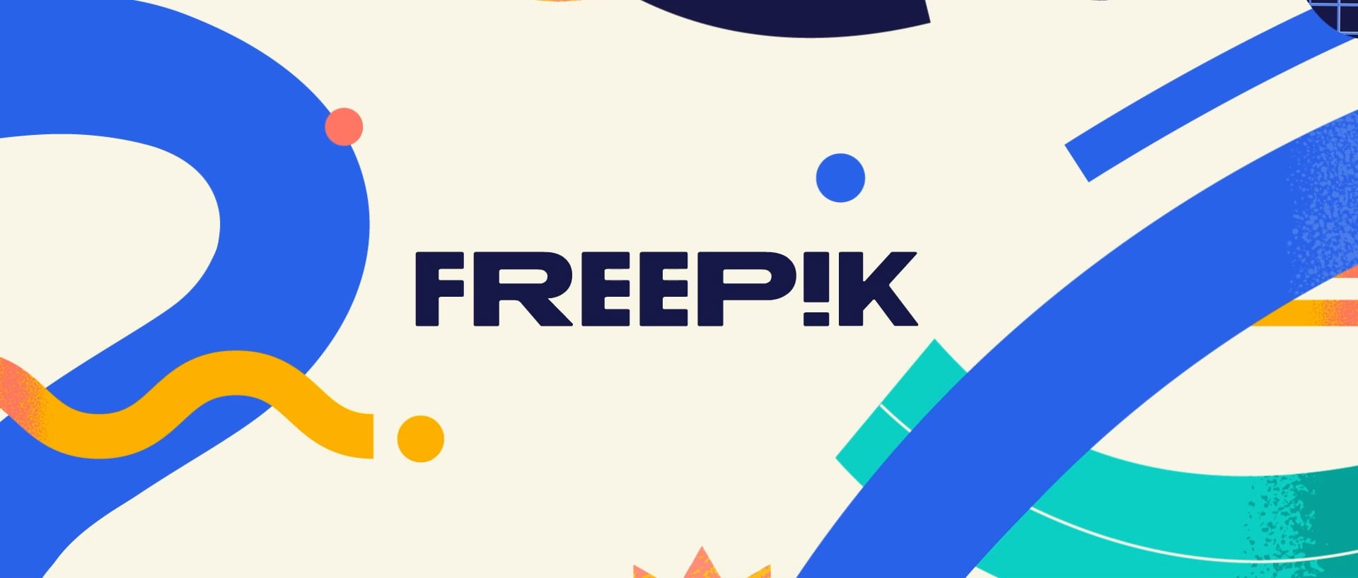
04 Logo
Making our mark
Yes, we have a new brand identity. But why? The decision to revamp our logo came as a natural evolution of our corporate mission and with a keen eye on the future of our business.
The new brand is meant to symbolize the power of ideas and how they can be turned into great design, fast.
Its variable-width characters represent the fluidity and freedom of exploration inherent in the creative process. The inverted "i" becomes an exclamation point, representing the spark of joy that comes from a great idea.
Let’s see how to use it together.
Download the logo
05 Isotype
Basics
Our isotype is an extension of our wordmark, distilled down to its purest essence. The isotype can be used as a favicon for browser tabs, as a social media avatar, or as a secondary graphic element in swag.
Our logos are focused on web use and have a responsive version where the isotype applications take over the role of the logo.
Download isotype
256x256
224x224
192x192

160x160
128x128
06 Color
Primary color
Freepik color has always revolved around our core brand, Piki Blue. The new Freepik color palette follows suit, but expands in a more personal direction with tones inspired by our seaside home of Málaga.
In addition, our new palette offers dramatic contrasts with colors that are rich and dark while others are bright and pop. The result is a fun and flexible palette that tells our story in a unique and modern way.
Our primary color palette is rooted in cool tones that build upon the equity we’ve built with our use of blue. Additional new colors like Mediterranean and Málaga Red provide a punch of brightness and energy.
Download color palettePiki Blue
- Hex 336aea
- RGB 51 106 234
- Pantone 2727c
- C80 M60 Y0 K0
Deep Blue
- Hex 22244e
- RGB 34 36 78
- Pantone 274c
- C98 M94 Y38 K35
Mediterranean
- Hex 17d1c6
- RGB 23 209 198
- Pantone 3252c
- C78 M0 Y35 K0
Málaga Red
- Hex ff7d6a
- RGB 255 125 106
- Pantone 170c
- C0 M70 Y55 K0
Off White
- Hex faf6e7
- RGB 250 246 231
- Pantone 9226c
- C1 M2 Y10 K0
07 Typography
Primary typeface
Now that the rationale for a new Freepik logo is clear, let's apply a similar mindset to why we're introducing new typefaces to the brand.
Our typefaces need to be well-crafted, hard-working, and infinitely legible. And they must also convey the burst of creativity at the heart of our offering.
The result is two typefaces that work together. Our primary typeface is Degular. The typeface’s modern-yet-timeless characters and flexible font weights make it ideal for showing off our brand personality.
Use it for headlines and highlighted paragraphs only.
- Degular Regular
- Degular Semibold
abc123
08 Freepik brands
Our portfolio
Our logo is essentially the face of our brand, and it needs to be contemporary (but timeless), fresh, and inspiring. It should illustrate and inherently symbolize the power of ideas and great design.
Download logosDownload and edit icons and stickers for your projects.
Create videos and motion graphics with tempates, royalty free music and sounds.
Google Slides and PowerPoint templates to boost your presentations.
Free templates and easy-to-use online editor to create outstanding design for small businesses.
As part of Freepik, you are invited to help shape our company narrative and how we help people turn their ideas into great designs faster, so they can express the power of their ideas.
And that’s where this handbook comes in - to give you guidelines to make sure that whenever we tell our story, it’s consistent.